Services
Brand manual development

Why a brand manual is indispensable for your brand
A brand manual ensures consistency in everything your brand shows and says. It is the foundation on which you build. Whether you are commissioning a website, designing a brochure or working with external parties.
In this guide, you lay down not only your visual style (such as logo, colour palette, typography and photography), but also your brand story, tone of voice and behavioural guidelines. Everything needed for your brand to come across as recognisable and professional. In every expression, on every channel.
You will find this in your brand manual
The building blocks of your brand in images and language
Logo use
In the brand manual, we lay out how to use the logo appropriately. From large to small, and on both light and dark backgrounds. This keeps your brand recognisable and powerful, in every application. We show examples of correct and incorrect applications, so that everyone working with your brand knows how to use the logo consistently. On print, online, in presentations or social media.
A professional logo deserves a clear set of guidelines. That prevents dilution and strengthens your brand identity with every expression.
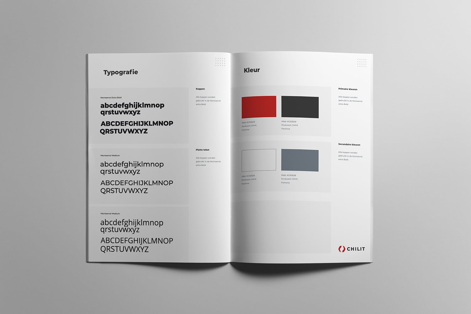
Typography
The choice of fonts largely determines the look and feel of your brand. In the brand manual, we define the typography used, from headings and sub-headings to reading texts, both for print and digital applications.
We define font sizes, line spacing and hierarchy so that texts are consistent, legible and recognisable in every expression. From website to brochure: typography that’s right reinforces your brand.
Use of colour
Colour plays a crucial role in brand recognition. In the brand manual, we compile a balanced colour palette with primary and secondary colours that match your brand identity.
We define colour codes for print (CMYK), digital (RGB) and online (HEX), so that colours appear exactly the same in every application. We also provide guidelines for combinations, contrast and use on light or dark backgrounds.
A well-chosen colour palette makes your brand visually powerful, recognisable and professional. Everywhere it is visible.
Lay-out
A consistent layout structure ensures peace, balance and recognition in all your communications. In the brand manual, we lay down fixed guidelines for area division, margins, white space, distances and use of form.
Whether it’s a brochure, presentation or social media post. Clear layout rules ensure that your brand remains visually strong and consistent, no matter who works with it.
With smart layout principles, you bring structure and style to every expression.
Photography
Images often say more than words. In the brand manual, we lay down which photography style suits your brand. Think of image saturation, plane division, focal points, colour tones and composition.
We give examples of desired image types. From portraits to atmospheric images and name what does and does not fit within the visual identity. This keeps your photography recognisable, professional and in line with the rest of your branding.
A consistent photography style strengthens your brand’s emotion and appearance, on every page and platform.
Tone of Voice
The way you write says everything about who you are as a brand. In the brand manual, we define the tone of voice your brand uses: quick and direct, friendly and informal, or businesslike and expert.
We define word usage, sentence structure and tone, so that everyone who communicates on behalf of your brand does so in a consistent way, online, in campaigns, in e-mails or on social media.
A clear writing style ensures recognition, trust and connection with the right target group.

Ready to capture your brand consistently and professionally?
Leave your details and I will help you create a brand manual that really works. In image, tone and direction.