Ronico Tulips
Growing beauty, rooted in Dutch heritage
Ronico is a renowned family-owned tulip company based in the heart of North Holland. Founded in 1939, the company has grown from a small-scale flower grower into one of the world’s leading tulip producers. With over 75 years of craftsmanship, innovation, and international reach, Ronico delivers millions of tulips each year, nurtured with passion, precision, and an unwavering eye for quality.
Time for a brand identity that grows along
At Ronico, everything revolves around growth. While the company has embraced modern techniques and global ambitions, its visual identity hadn’t kept pace. That’s why Ronico reached out to us for a full rebranding: to create a bold, distinctive brand image that reflects their professionalism and heritage on an international stage.


Immersed in the essence of the brand
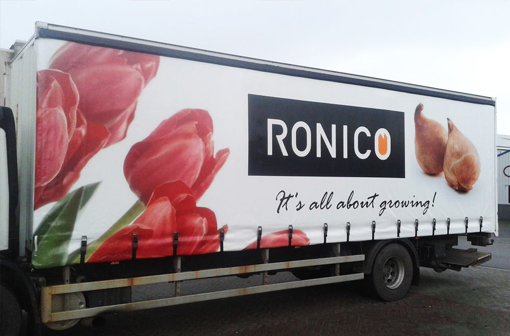
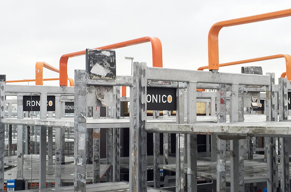
A brand identity that blossoms with purpose
The result is a fresh, colorful visual identity that feels both modern and grounded. At the heart of the logo is the iconic orange tulip, a bold symbol of Ronico’s core business. This tulip also acts as a “window” through which the company’s values, methods, and innovation are reflected.
The shade of orange was chosen with care: not only does it match the natural hues of real tulips, but it also proudly carries the Dutch national color. The overall visual identity is clean, vibrant, and unmistakably Ronico, rooted in tradition, designed for the future.