
OZBL
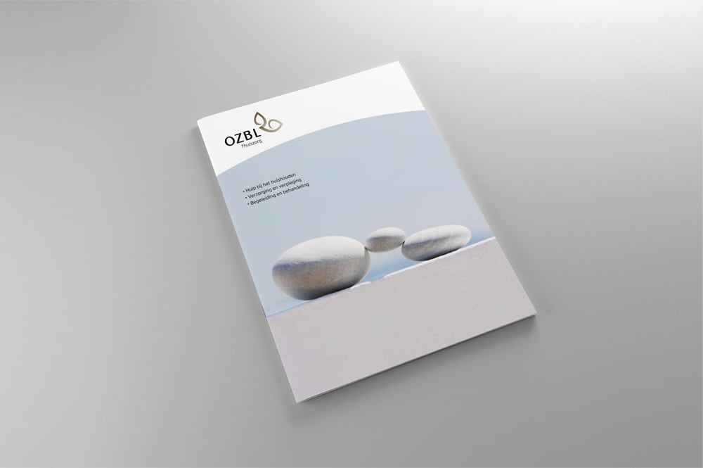
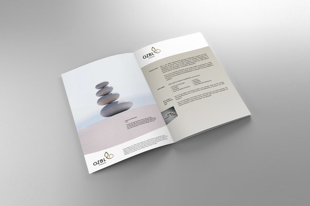
A company engaged in oncology and customized care needs a restrained and humane look. The orange-like shapes with natural colours symbolise care for one another. As a visual language, we chose to work with pebbles that, just like humans, are each unique and tell their own story.
ClientOZBLServiceBrand Identity
Share