Kuehne+Nagel

Rebranding

Kuehne+Nagel is a global logistics service provider. Kuehne+Nagel offers all transportation options such as international shipping – by sea, air and land. In addition, Kuehne+Nagel manages more than 10 million square meters of storage space worldwide.

Why did Kuehne+Nagel approach us?

Within Kuehne+Nagel the internal communication department is responsible for the communication between employer and employee. Think of instructing new managers, announcing new working methods or motivating staff. For years, Deep has been asked to translate the brand identity into professional graphic expressions such as flyers, brochures, posters, gimmicks etc. It is always a challenge to create surprising new designs that fit perfectly within the Kuehne+Nagel style and guidelines.

Our approach

I see the design process for Kuehne+Nagel as ’the search for the perfect balance between creating new designs and staying true to the brand identity’. In this process, it is essential to deepen and make the K+N brand guide your own. If you understand it and really feel it, then you know why certain choices were made and it is possible to create something surprising and distinctive again and again.

The result

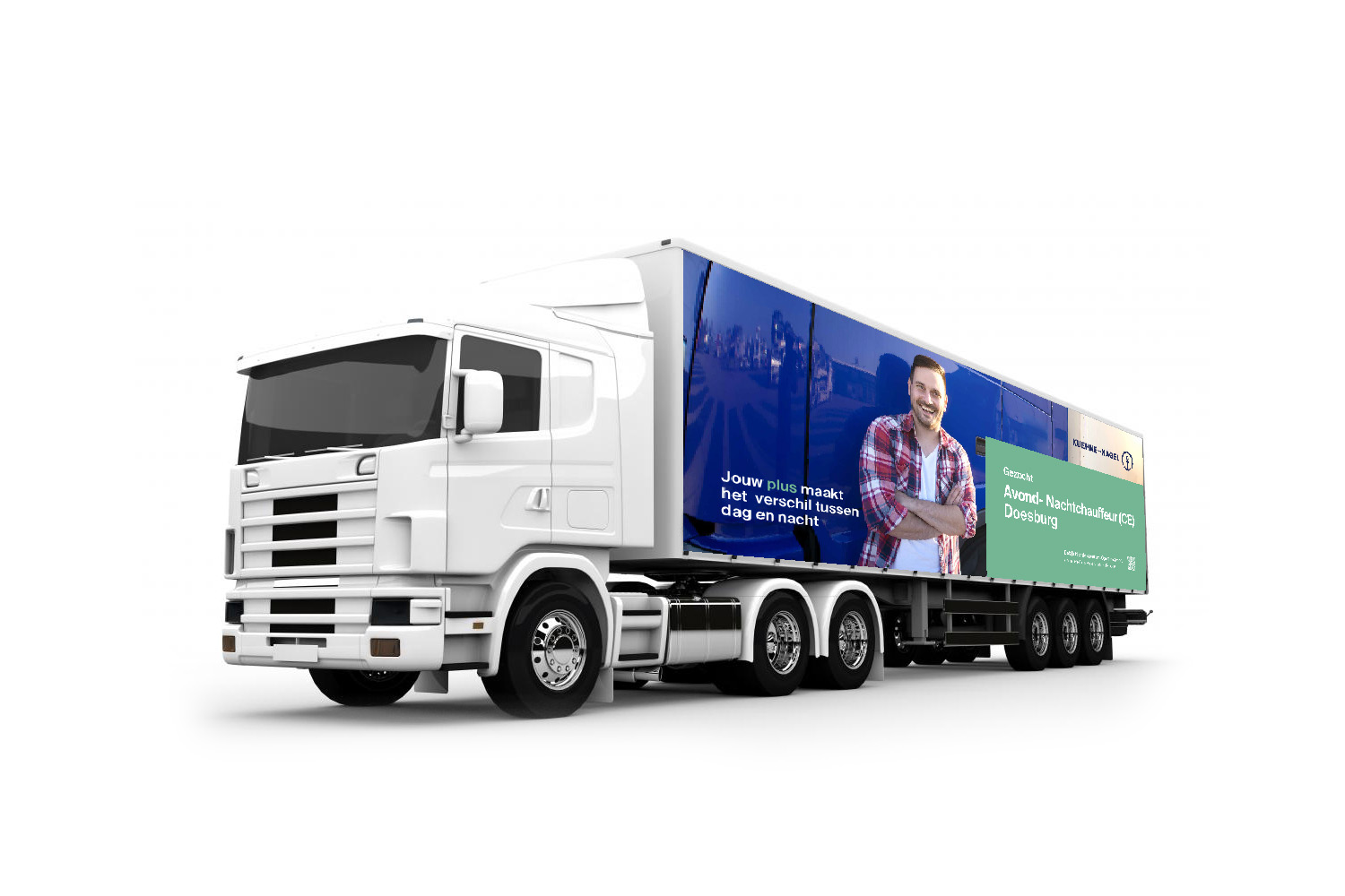
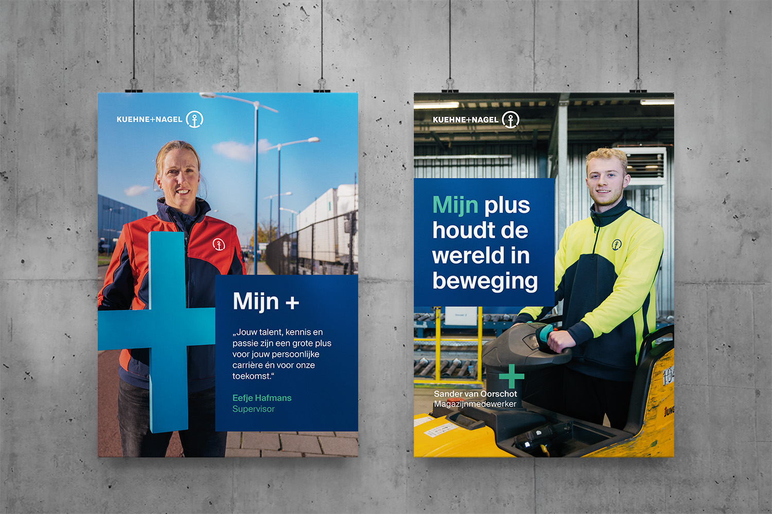
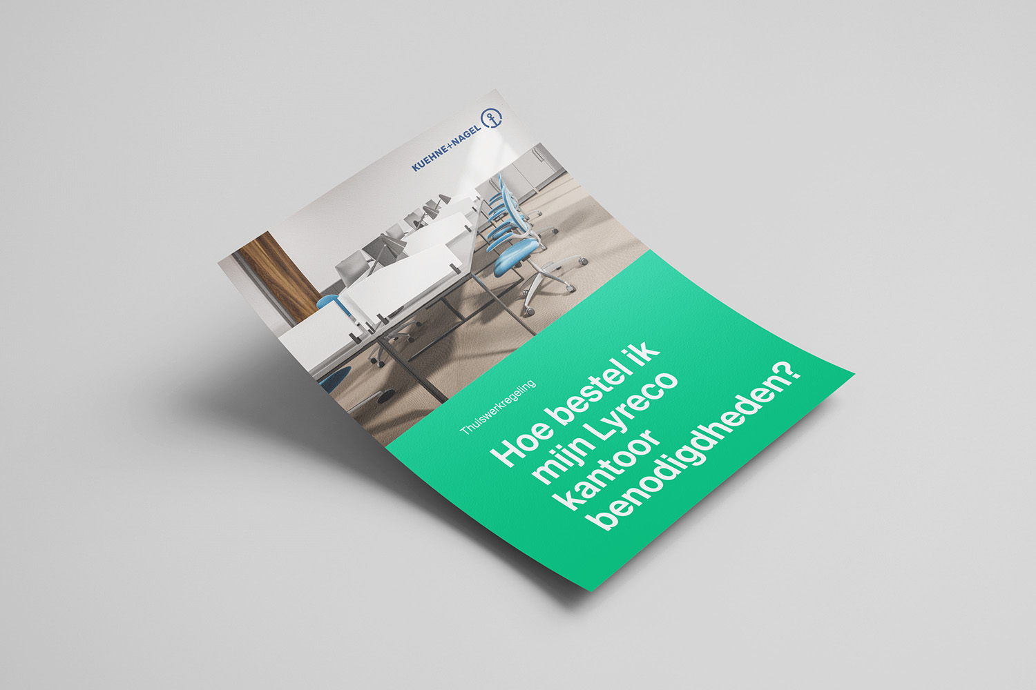
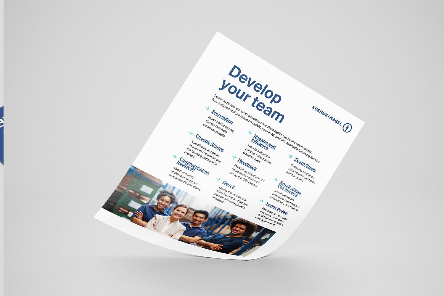
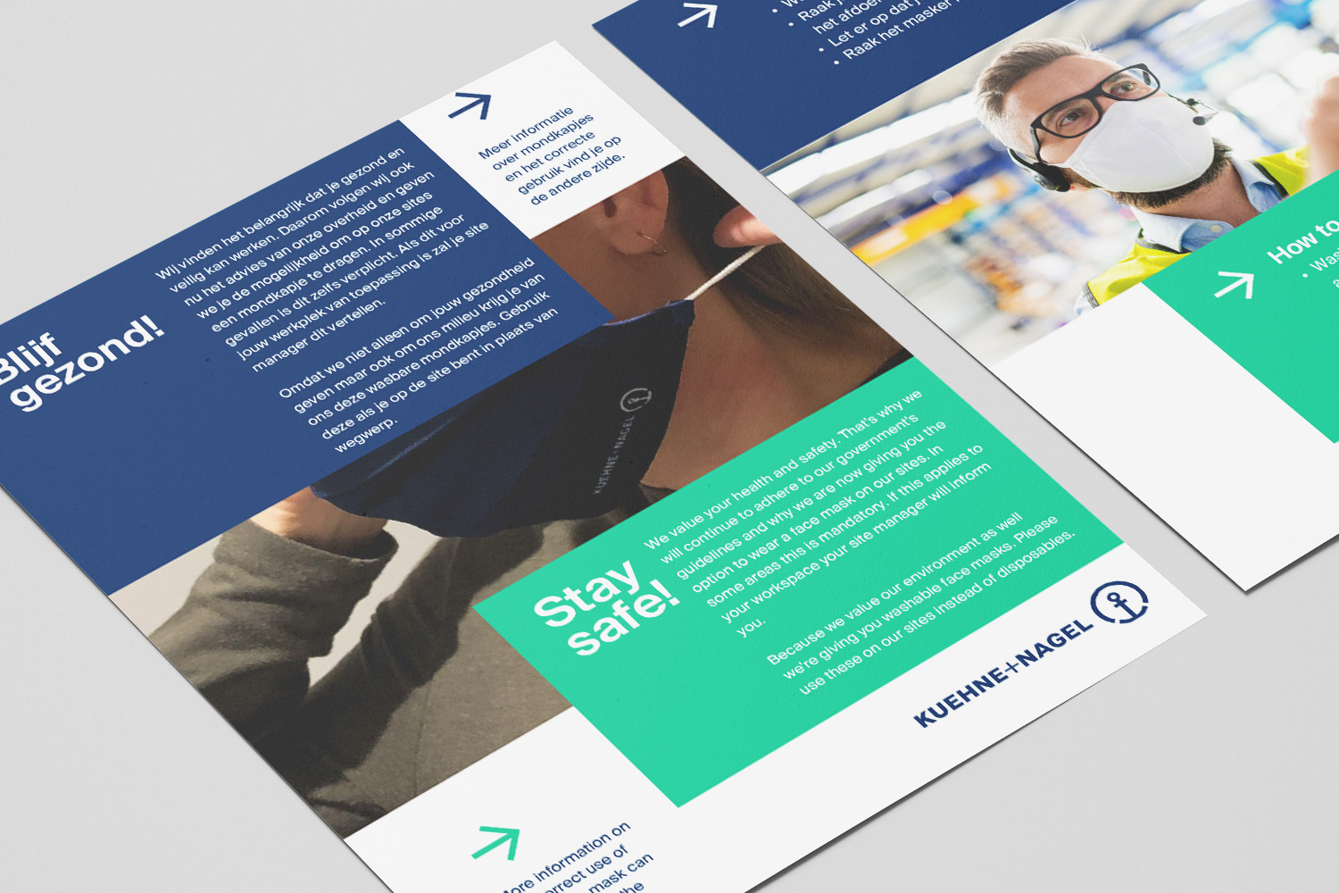
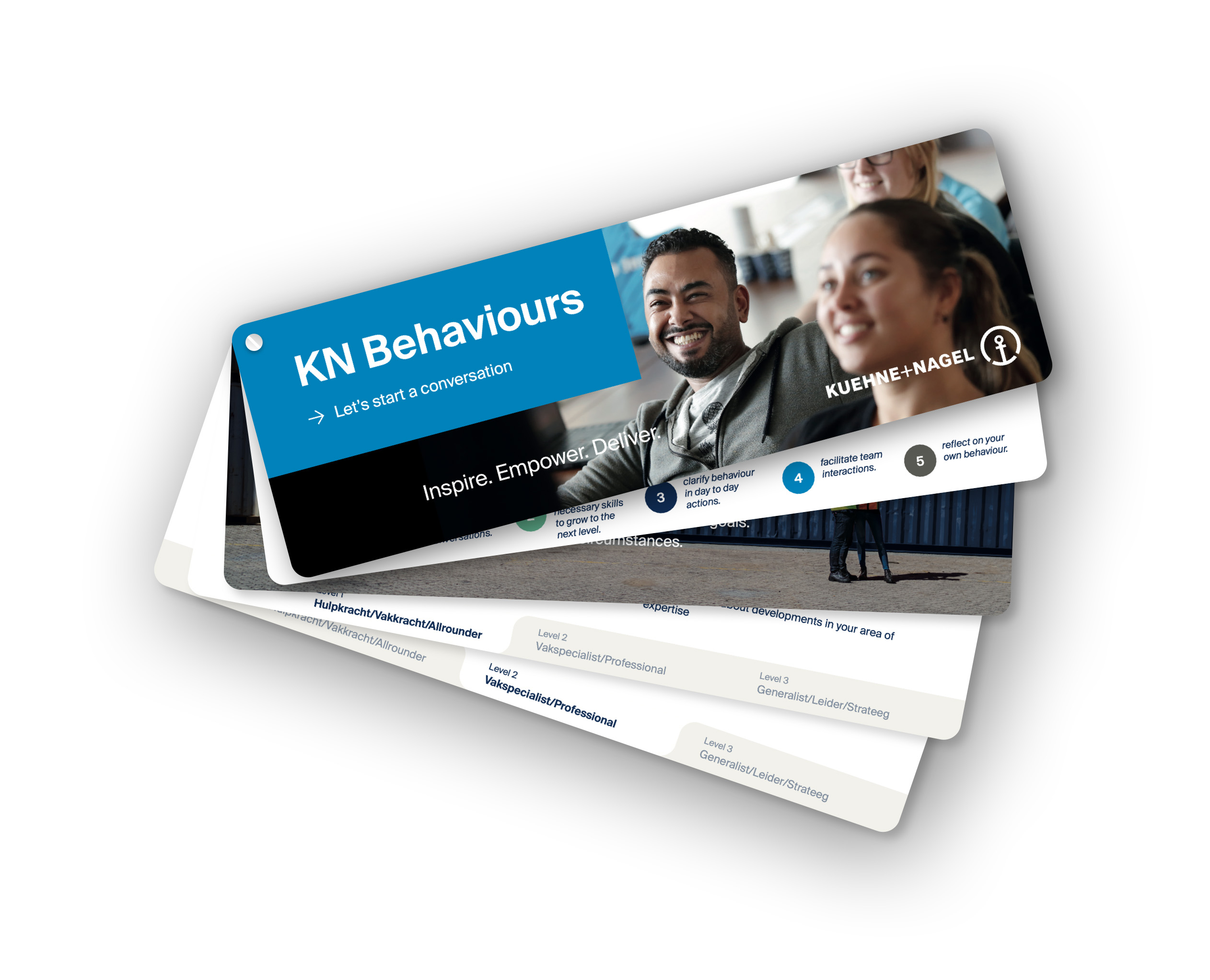
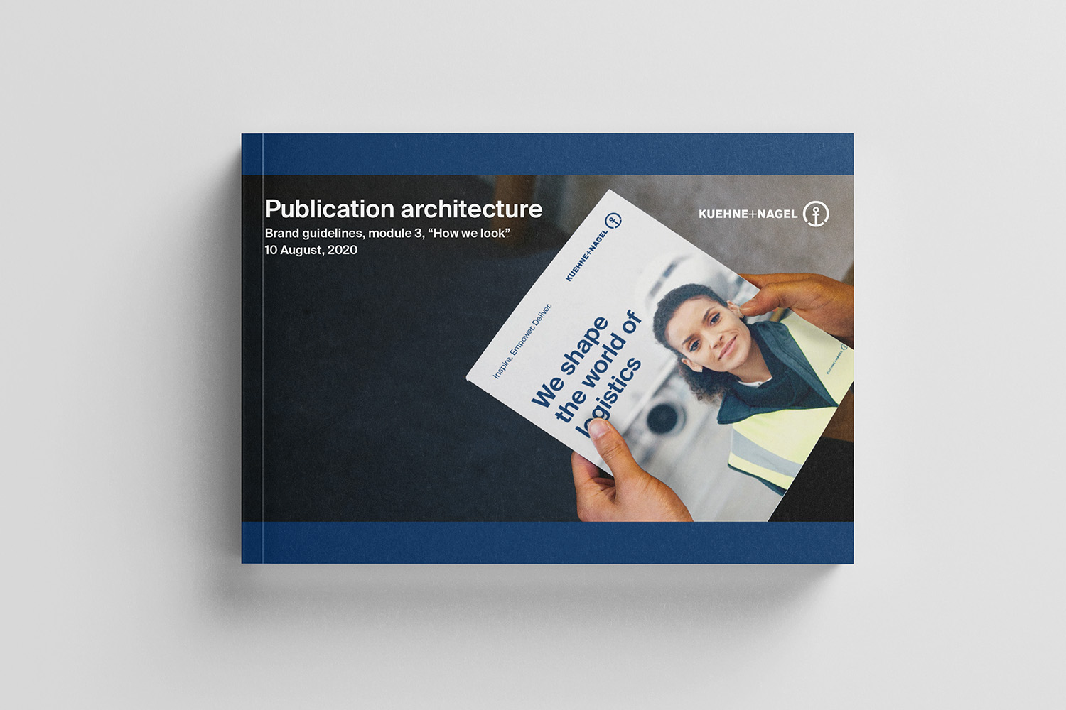
A beautiful series of flyers, posters, brochures and promotional materials. Each design carries its own signature and fits perfectly with the brand identity of Kuehne+Nagel.